Marlon Studio
N/AOctober 28, 2021
Mindsparkle Mag


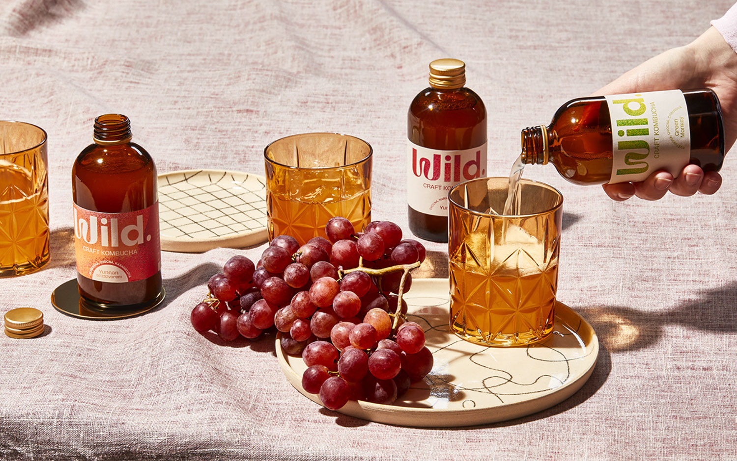
Wild is a fermentation brand whose aim is to change the landscape of commercialized kombucha with a 100% naturally crafted product. It's taste-fords, with no additional flavorings or artificial carbonation, and delivered fresh to the consumer’s door on a subscription-based model. Marlon Studio’s task was to design Wild's branding, representing its product quality and communicational modernity, freshness, sustainability, and playfulness.
The idea was to create a visual identity that is both accessible for new shoppers and their small, passionate niche. The phrase ‘fermentation is a culture of billions, working together, being alive’ was the inspiration source for the visuals. With this idea in mind, Marlon's designers developed a series of dynamic, textured gradients, following one of 2021's more used trends. The grainy texture aims to represent the bacteria colony responsible for the kombucha's process.
Creatives came up with a bold, typographic logo featuring an organic initial, representative of Wild's relation to nature. Plus, its minimalistic bottles and ultra sustainable packaging are more than on point! Also, a clean layout system based on contrast, layering, and bubbles!
We love Wild's sustainable focus and how the brand deeply engages with it. This took a big step thanks to a partnership with Marlon studio. When working together, they reflected the sustainability pillar on the labels and the packaging boxes for deliveries. Both materials are recyclable and add to the brand a pure and rustic feel. In contrast with the labels, designers decided to make 100% of the brown cardboard boxes laser-cut, avoiding printing techniques.
Additional credits Photography: Marek Bartoš Copywriting: Salwa Benaissa
Creator: Marlon Studio