Arithmetic
N/AJuly 01, 2019
Mindsparkle Mag


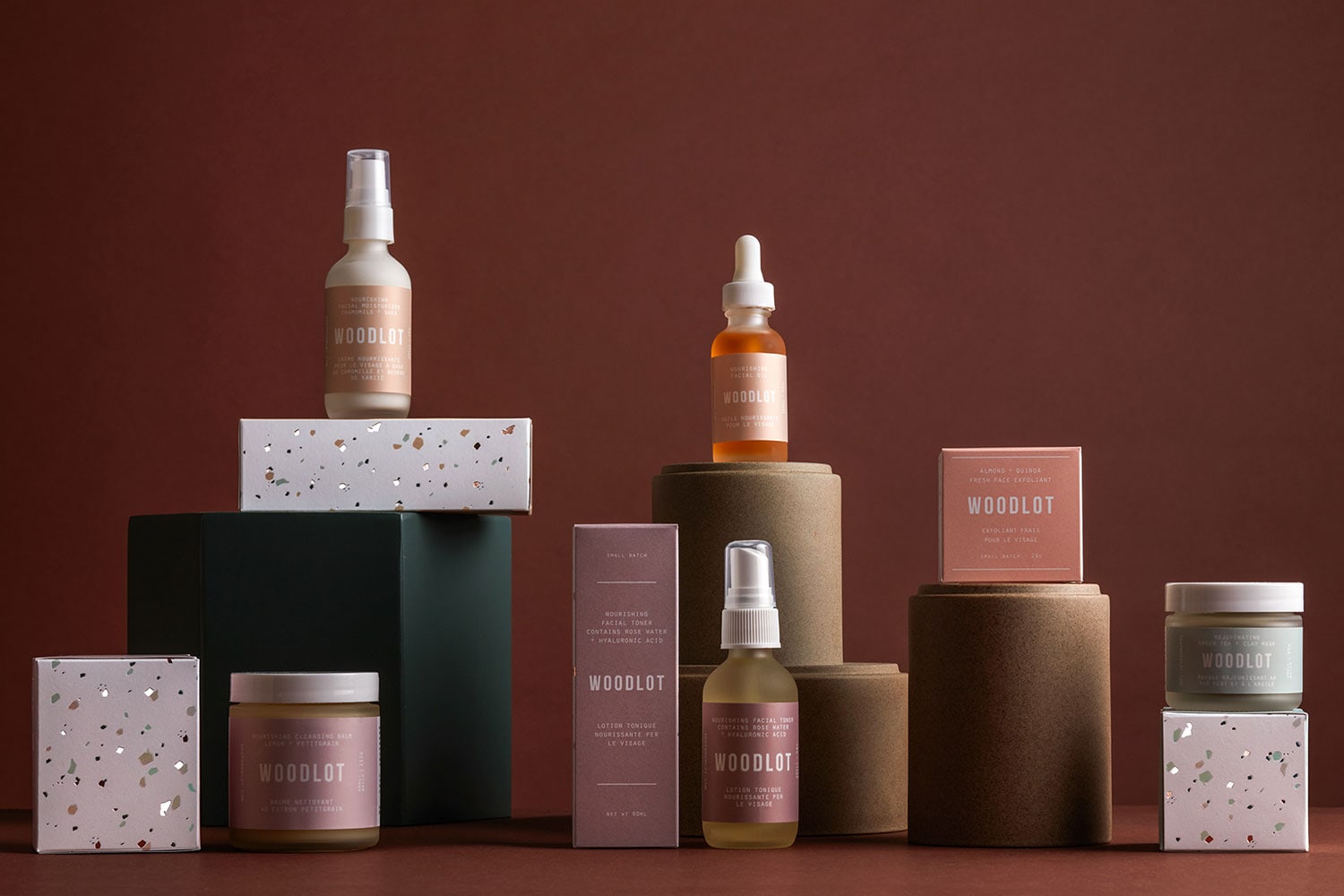
arithmetic designed the packaging for Woodlot Skincare. A visual conversation written about a womans’ journey from the vanity of human desire to the purity of self love. In a world of heavily marketed cosmetic and skincare brands on perfectly adorned models, our idea of beauty and youth can be skewed, even when we claim to have a healthy reflection of what we see in the mirror, the inner critic speaks loudly at times. In this light, “She” is mother earth. The one who bore us so purely, so perfectly. When we return to her, we return to a simple way—innately stripping away the man made ingredients that do more harm than good. In returning to her with the wisdom of self growth, we find ourselves, natural and beautiful in her eyes.
Arithmetic’s packaging program for Woodlot Skincare is an ode to this love story. One of patience, of whole love for the earth and in that, self-love. The myriad of metallic fleks and muted jewel tones adorning the boxes are inspired by Mother Earth’s jewelry box of minerals and stone. Designed in Vancouver Canada
Creator: Arithmetic