Stretchd
N/AOctober 18, 2018
Mindsparkle Mag


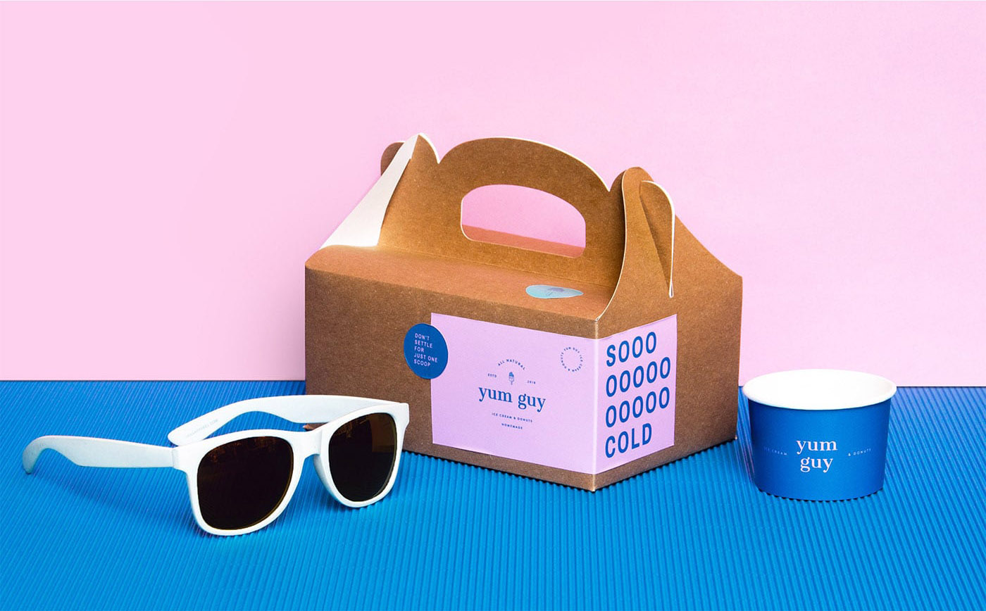
Beautiful branding and packaging for Yum Guy Ice Cream, by Stretchd Design in Poland.
The challenge was to create a completely unique experience for both adults and their children. When the studio first met with the founder he said he wanted something very colorful and eye-catching, something that will stand out, but at the same time it had to be obvious, that it’s an ice cream brand. Yum Guy is a start-up, but the founder has been selling no-name ice cream for two years already and therefore recognized the importance of good branding. The challenge was to take his ice cream with good-quality ingredients and convince people to actually buy them.
designed a bright and fun visual identity using 3 main colors: pink, teal and aquamarine. The color palette highlights the summery feel of the brand that reminds of hot beaches and lazy days on the sand. The main character is Yum Guy - a friendly and saucy ice cream man. They also designed some icons and an ice cream pattern to use on various company materials. Ice cream cups, boxes, stickers and stationery were also a part of the branding experience.
Creator: Stretchd