Rafael Maia
N/ANovember 24, 2018
Mindsparkle Mag


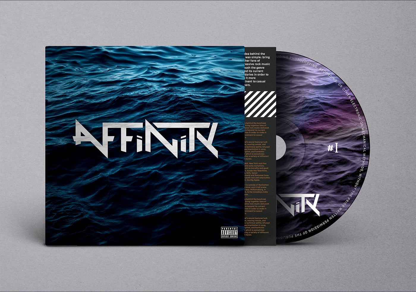
Beautiful rock band branding for Affinity by Rafael Maia in Portugal.
Affinity Rock Band from New York. The idea behind the band was simple: bring together fans of progressive rock music and push the genre beyond its current boundaries in order to make it more prominent to casual listeners. The band’s sound features lush melodies, searing vocals, and intricate technical ability infused with experimentation in song form, rhythm, and harmonic content which is sometimes inspired by a variety of different musical styles.
Since 1960, New York rock has undergone some mutations. Indifferent to morality and good manners, bands like Television, Stooges, MC5, Velvet Underground and Ramones have created punk rock and alternative circuit in the Big Apple. Today, it is outside of Manhattan that the local rock'n'roll scene goes its way. Williamsburg, in Brooklyn, is the nowadays indie lighthouse.
The typography, designed letter by letter, was created to transmit the DNA of the band. Striking edges and sharp angles add personality to the logo. The thickness of the stroke and the ratio of width to height makes it balanced and easy to apply in various media and formats. The result is a dense logo, striking and that perspires rock'n'roll.
Creator: Rafael Maia