Filip Triner
N/A , N/AFebruary 10, 2018
Mindsparkle Mag


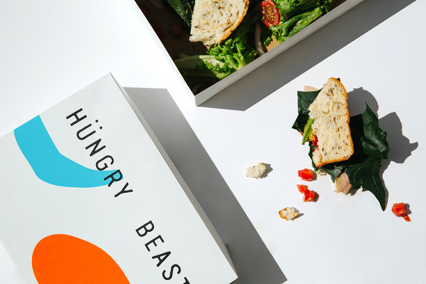
'Hungry Beast originates from the need to create a café and a place where health meets casual. It was designed with a big personality, with a focus on health-consciousness, but wanted to avoid the in your face attitude of most commonly associated with the health trend. It is beyond a fad; it is about the simplicity in providing quality products, healthy ingredients, and creativity in preparation.
Through the visual elements and materiality of the space, SAVVY STUDIO were able to create an atmosphere that felt authentic and honest. Quality and simple materials such as wood and clean lines were maintained in the small space to let the ingredients stand out.
This idea is reflected in the choice of visual representations for the brand. Baldessari’s Connecting Dots and Gemini series were the main inspiration for the branding element. Through stripping back packaging elements to their core with a simple abstract detail of colour reminiscent of Balderassi’s Gemini series.
The visual applications such as the boxes and the takeaway bags were kept with the name of the restaurant stands out as the main element. Adding haphazardly throughout the various elements, from the cups to the boxes, to the napkins and to the tote bag. The elements add a feeling of fun and light-heartedness to the brand. It is about taking health-food not too seriously.'