Buenaventura Studio
September 26, 2025
Mindsparkle Mag


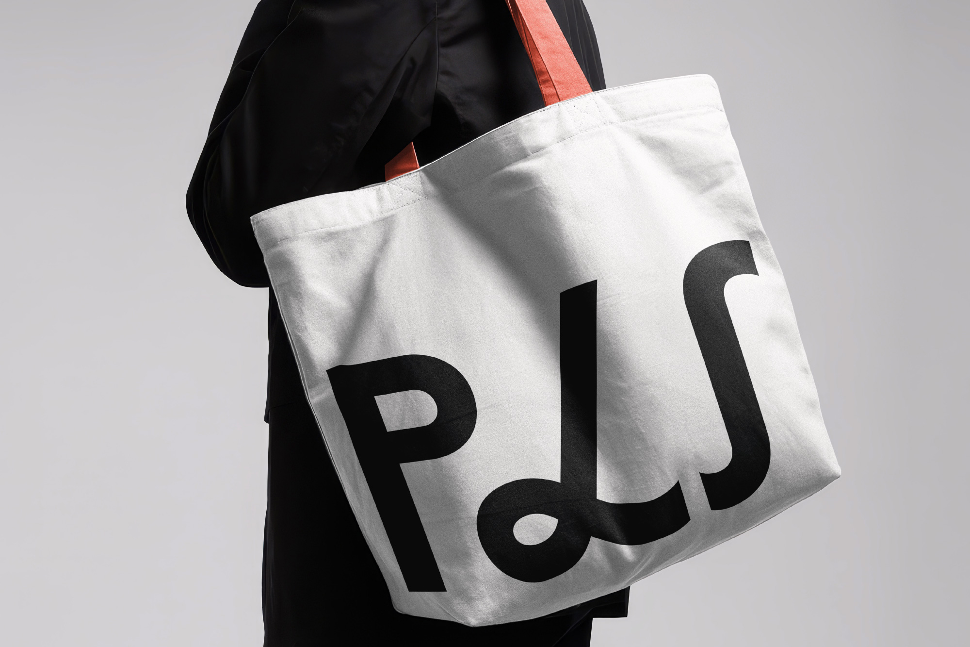
Language is much more than a communication tool: it is a bridge between cultures, a shared territory where people, ideas, and learning meet. PLS, a Buenos Airesbased company specializing in language training for executives in multinational contexts, embraced this premise when faced with a challenge: to build a visual identity that reflected its expertise, international outlook, and vocation for bridging cultures through words .The result is an identity built around a central idea: the beauty of understanding. A proposal that elevates language as a refined form of connection, weaving together cultures and learning in a dialogue without borders.
At the foundation of the project are phonetic symbols, the graphic origins of language. From their symbolic strength emerges both the logo and a custom-designed typeface. This proprietary alphabet captures the functional and expressive character of PLS: a typographic system infused with rhythm, harmony, and sensitivity, transforming phonetic signs into universal graphic forms.With this tool, PLS gains not only coherence and visual consistency across all platforms but also a distinctive voice in every communication context.From this linguistic root unfolds a visual system that elevates the brands identity, turning language into a structured, sensitive, and universal expression.
The color palette revisits PLSs foundational tones and projects them into the present. Black and white evoke the origins of written language, while the red and blue of the original identity are now reinterpreted through a contemporary lens, bringing solidity and freshness to the visual system.
The phonetic universe also becomes the graphic foundation of an illustrated layer that extends the identity beyond the verbal. These universal signs are reimagined as ornamental forms with strong evocative power, transforming their linguistic value into a visual expression that is both poetic and compelling. In this way, language itself becomes a sensory experience that reinforces the projects central idea: to make the beauty of understanding visible and to graphically represent something that is, by nature, already beautiful.
The convergence of the custom typography and the illustrated layer constitutes the core of PLSs identity. Conceived as complementary elements, they create a graphic narrative that materializes the beauty of understanding and translates it into a visual experience.
Creator: Buenaventura Studio
Corporate Typeface: Buenaventura
Animation: Alexandre Marqués and Buenaventura
Web Development: Baetica
Photography: Lucila Schuchner